© 2024 fjorge. All rights reserved.
How to Create a Radar Spline Area Chart

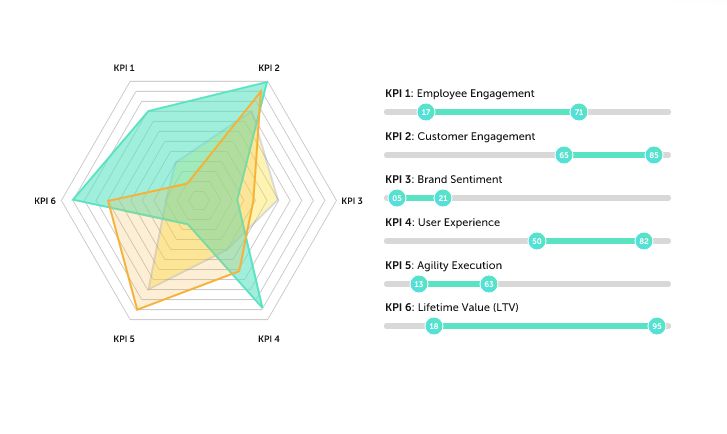
If you've found this article, congratulations! Only statisticians seem to know what it's called. It looks like a big blob in a frying pan.
But once you've found out what it's called, the rest is fairly easy with the jqchart jquery plugin. You can fully customize the chart for however many categories you have and then you inject the data.
It requires simply one div with a class or id so you can select it. The div is made into a canvas and the chart is drawn for you.
jqChart is a one-stop place for all your charting needs with jQuery. Any other kind of chart you could imagine can be generated with the jqchart plugin, including bubble charts, scatter charts, pie charts, financial charts, and even the plain and simple bar charts.
Another alternative for Radar charts is to use a combination of jQuery and Google Charting. The resulting chart does not have a radius or values listed as does the jqChart plugin, but it's just as easy to use. And Here's an example of where you can find it: Chart Types.
It is also possible to develop your own functions in JavaScript to make your own charts, but with the ease of use jqChart provides and with its flexibility, it's hard to imagine why you wouldn't just use that.
